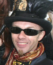
Since exploding onto the horror scene with his iconic poster art for The Evil Dead, artist extraordinaire Graham Humphreys has been a key figure in the film art community with many stunning works that resonate with genre fans making him one of the most loved modern movie artists. In our latest SGM Spotlight interview, Stu Willis talks with Graham about his rise to exploitation art fame!
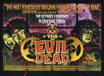
Stu: How did it all start for you? From studying art at Salisbury College in the late 70s to producing some truly iconic artwork for early 80s Palace Video releases such as "Basket Case" and "The Evil Dead"?-
Graham: After leaving college I began work on my first commission, illustrations for an educational publication called ‘Handling Language’. This involved a large volume of cartoons intended to give a friendly face to an otherwise bloodless subject. My second was a book jacket for a horse racing thriller - the image contained a mountain setting with a blooded knife in the snow. Not a horse to be seen! I was rather proud of the atmospheric colours but spilt my brush water over the entire painting just as I’d made my final stroke! Luckily, aside from a slight water mark, I managed to rescue the piece and deliver it without any problem. I took my folio of college work where ever I felt I could get work and relied on suggestions from those that I saw for further contacts. I took whatever work I could get whilst living a very impoverished existence - book jackets, magazine work, visuals - impoverished days living on stock cubes and frozen kidney beans! Several contacts down the line brought me to the doors of Palace Pictures at the King’s Cross Scala Cinema. The commission for ‘The Evil Dead’ poster was a very lucky case of being in the ‘right place at the right time’.
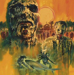
Stu: Those early days were very busy for you, at a time when artwork really made the difference between a film finding success on video or fading into obscurity. My favourite poster of yours from that era is for "The Return of the Living Dead". I had a giant video-shop cast-off of it on my bedroom wall as a teenager. How come that work hasn’t been seen on DVD releases? It would’ve been nice if Second Sight’s blu-ray had used that poster art.
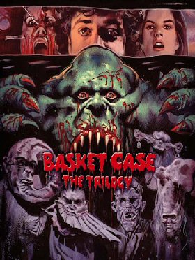
Graham: In retrospect I’m slightly embarrassed by my lack of technical skill in the production of my ROTLD artwork, but it still does have a bit of life in it (ironic as that may seem) and like most of the work of that decade, the colour palettes were a direct response to the music I listened to at that time. One of the songs on the ROTLD soundtrack was by The Cramps, a band I still adore to this day, and as with the ‘The Evil Dead’ poster The Cramps ‘Psychedelic Jungle’ album inspired many lurid colours! Though my illustration didn’t feature on Second Sight’s release, I did revisit the image for a screening poster and subsequently they commissioned me to revisit ‘Basket Case’ - and I have more in the pipeline for them.
Stu: Sticking with unused artwork, your site – www.grahamhumphreys.com – shows wonderful artwork for "El Topo", along with numerous other titles, which I’m not aware of being used. Why is this?
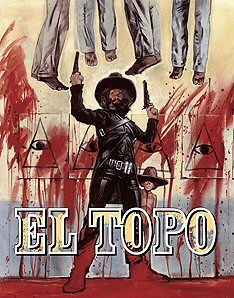
Graham: That particular illustration was originally intended for the Tartan Films’ UK DVD release, but a photographic solution became the preferred option. However, I handled the subsequent design and photoshop work anyway and the illustration was nevertheless used as a pull-out poster in Sight & Sound magazine (the respected British Film Institute publication). Jodorowsky himself told me that it was his favorite poster for his film - you can’t get better praise than that!
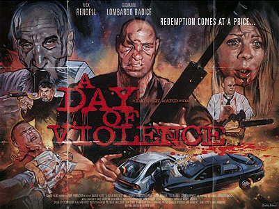
Stu: Your poster art for "A Day of Violence" was a real throwback to the outrageously violent Italian crime films of the 70s. Are you a fan of those films?
Graham: Absolutely. Over the last couple of decades they have taken on a new lease of life. Whilst they might have become dated within years of being made, they now seem breathtakingly fresh and imbued with a vigour that is rarely seen in contemporary films outside of Asia. I’m fascinated by the taboo breaking themes and ideas - they really do highlight the retreat into neo-conservatism that blights big budget cinema today.
Stu: I’d like to speak a little about how you work. How do you prepare yourself when considering poster/cover art for a film? Do you have final say? And do you consider it imperative that you’ve seen/enjoyed the films you’re designing posters for?
Graham: I usually see a film in advance and I don’t necessarily need to actually like the film in order to seek out the visual hooks. The initial ideas usually stem from material available, though I’ll normally supplement this with elements of my own. I try to keep an open mind on possibilities and my best ideas occur in the deep sleep just before I wake. The client always has the final say, but it is my job to steer them in the right direction (or what I believe to be so).
Stu: What materials do you tend to use, and how long would you expect to spend on any piece of work?
Graham: Most of my work is painted using ‘designer’s gouache’, a watercolour pigment with a white base. Whereas watercolour is transparent, gouache is opaque. Being waterbased means that it dries swiftly allowing me to exploit the coarse texture of the paper with a drybrush technique. Very occasionally I might use a bit of coloured pencil. In the past I used small amounts of oil pastel over the surface of the gouache to brighten specific areas - it makes a mess of my A4 scanner so I don’t use it anymore! The length of working time depends on a number of factors, though image complexity is by far the most decisive. I have learned to work fast and some jobs might take only a day, whereas others up to four days.
Stu: What’s your preferred environment when working on illustrations? Does the music come on, or are you one to work in total concentrated silence?
Graham: I currently work in a shared space so my personal choice of music requires earphones, something I don’t really like using. I find absolute silence even more distracting than sound. The earphones are on more often now - I’ve rediscovered the inspiration that music can bring.
Stu: Do you go through various concepts before hitting on the right one? If so, can you divulge any ideas or artwork that you’ve discarded and which have never been seen since?
Graham: There is often more than one solution to each challenge and working with a selection of key elements, the various configurations can make a big difference to the overall focus. I try to offer at least three sketched options, though it might often be six or more. After initial thumbnail scribbles that I use as a guide I scan individual sketched elements then composite them in photoshop. On a recent job the client found themselves torn with too much choice and decided to commission two paintings instead of one! (Death Waltz Recordings vinyl release of the ‘Zombie Flesh Eaters’ soundtrack).
Stu: Out of your formidable portfolio, which is your favourite piece of artwork?
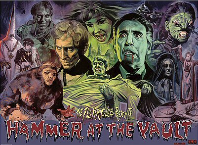
Graham: Nothing in particular in all honesty - though there are many that make me squirm with embarrassment. If pushed, I am still very happy with the Nightmare on Elm Street 2 ‘Freddy’s Revenge’ image. I’m also proud of the recent ‘Flicker Club presents Hammer At The Vault’ festival poster. I usually tell people that my favorite has yet to be painted.
Stu: Do you ever get sick of seeing or signing your legendary artwork for "The Evil Dead"?
Graham: Never. As I said, I only wish I could have been more technically proficient at the time, though there is no denying it is still a perky little piece of paintwork - I still feel very happy with the colours.
Stu: And what’s your least favourite piece of work … and why?
Graham: There are many - as are the reasons!
Stu: Have you ever turned work down for reasons other than being too busy? If so, is it something you can tell us about and share your reasons why?
Graham: Not that I recall. I don’t remember ever having the luxury of being able to turn work down other than having a full schedule. Fortunately I have never been asked to work on a project that would have compromised my sense of respect for others.
Stu: I didn’t realise until recently that you also provided artwork for albums on occasion. You did the 3D cover for The Cramps’ "Off The Bone". Cool. How come you never dabbled more than you did in illustrating album covers?
Graham: Being freelance, the work is not selected but offered. Not my decision!
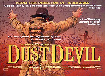
Stu: You even drew up storyboards for Richard Stanley’s first two feature films, "Hardware" and "Dust Devil". How did you find that process, working to someone else’s vision in a very structured way?
Graham: It was tough to deal with the sheer volume of drawing, but I found the experience invaluable. No problems regarding Richard’s vision, we shared similar tastes and working with Richard was more a case of trying to retain a structure! He is an inspiring gentleman and a passionate film maker. Storyboarding was a bit like directing and Richard was always open to my humble suggestions, it made the whole process so much more rewarding.
Stu: Can you shed some light on the tale of Stanley getting booted off the shoot of "The Island of Dr Moreau", which you also originally provided storyboards for?
Graham: Yes, but I’m not sure it is right that I should. There were many forces at play and it was probably a combination of any number. The David Hughes book ‘The Greatest Sci-Fi Movies Never Made’ offers Richard’s account and a few choice words from others involved. It should be a film in itself!
Stu: Did you see the eventual film that got made with John Frankenheimer directing?
Graham: Yes. It was upsetting to watch a film that so methodically destroyed everything that Richard had fought for with such great personal investment. It was excruciating. Though I could find solace in a certain trash aesthetic (one spotted by Southpark!), it does not excuse the neo-con agenda that bulldozed every spark of originality from the intended vision.
Stu: You’re also a graphic designer and, whether it being your designs or artwork (or both), you’ve worked with the leading UK distributors of genre films: Hammer, Tartan, Nucleus, Anchor Bay, Shameless, Palace ... Do you think the man on the street under-appreciates a good artist/designer’s role in the success of a theatrical/DVD release?
Graham: As a consumer of film myself, I detach myself from my work and view marketing on its own merits. I’m also a punter and subject to the whims of random purchase! I believe that people are very image aware and do appreciate craftsmanship even if they are unaware of the processes. That being said, I’m not convinced that the design of a poster or sleeve makes or kills a film. It might stimulate interest but films with dreadful campaigns survive and likewise, dreadful films will dive despite great art. Whilst a great image can catch the eye, I’ve bought plenty of films purely on the basis of reviews or from my own knowledge.
Stu: Do you tour exhibitions of your work? If not, why not? Is it something you’d consider?
Graham: I’d like to, but it costs money. Galleries aren’t interested without a financial return (which is fair enough). Even if there are alternative spaces available, insurance and safe transport is prohibitively expensive. I’ve only ever lost money in exhibitions or events. If someone wants to sponsor an exhibition you know where to find me!
Stu: Sim Branaghan’s BFI book "British Film Posters: An Illustrated History" calls you "the last great name among Britain’s film poster artists". It’s a huge accolade, but also an accurate one. Does film poster art have much of a future now, in the traditional sense, in an age where multi-media is more common and films are being seen on more formats than ever before?
Graham: Indeed it is a huge accolade, though I’m not sure it is any longer true. There may yet be a return to genuine poster art - if so, I won’t be the last! I’ve no problem with digital formats, I’ve illustrated for exclusive online presentation before and the origination is still paint on paper.
Stu: What are your thoughts on newer artists working within the genre, such as Rick Melton?
Graham: Delighted to see other artists strutting their stuff and I have always enjoyed discussions with the ‘Dude’ (Tom Hodge) about our chosen path. It’s good to see the variety - and each of us has our own particular take on the genre. Seeing the high calibre of work being produced helps me focus on my strengths and work on the weaknesses.
Stu: Finally, with a career that’s been associated largely with the horror genre, I have to ask: what are your favourite horror films?
Graham: I like different films for different reasons, but I’ve a particular fondness for all the Hammer Horror output. In addition, ‘Horror Express’ (1972) and ‘The Mist’ (2007) remain high on the list. Ask me tomorrow and you’ll get a different answer!
Special thanks to Graham Humphreys. For more information on his work and details on how to order prints of some of his classic artwork check out his official site here.